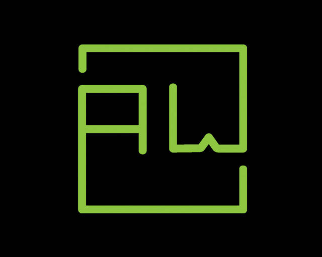
I designed this as part of my Graphic Design Portfolio back in 2009, this is probably my favorite piece I did for that! It’s a bit unrefined compared to the version I currently use, I don’t remember when I updated it; the middle of the W does not go flat anymore and the A and W are the same width in the modern version.
In the last few years, I’ve turned it into a favicon, as it’s perfectly square and can be scaled down to pixels.

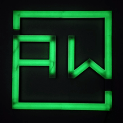
And more recently, I’ve turned it into a neon sign by using 3D printing.